#2. Interface and build 2.0.0.

As we said in the last article, Like Heroes turned out to be a good game with a very bad interface. And I'll tell you why, we planned the game for a very long time, thought through: different mechanics and systems, but we never thought how the player should understand all the ideas, it seemed to us that everything was simple and obvious. Therefore, I suggested that the artists draw the interface as they want. Do it in style, I said.
It was a huge mistake. After the release of LH, we received hundreds of messages in support, where players asked for help with the mechanics and with finding a button. It was a real struggle between the players and the interface. People loved the game, they loved our animated adult scenes and amazing stories, but they hated our buttons.
For 4 months we refused to believe that our UI is so vile that it is impossible to fix it. Christmas was approaching, and we thought about a gift for our players. And came up with the coolest gift, to make the game understandable, to add all the auxiliary systems that we were asked about and that we were not asked to add too.
Throughout the Christmas week, we went to friends and acquaintances and forced them to play LH and write down everything that they didn’t like in the game or that they didn’t understand or they understood at first one way, and then it turned out that it works differently. Christmas passed, the carp was eaten and all the feedback from the support channel, discord and from our friends was collected.
We sat down at the table and began to structure LH's usability issues. Oh guys, it was a real horror. We didn't have a single fully comprehensible screen. And Hero Pass, which had mountains of rewards, many players stopped noticing after a while. We felt ashamed in front of the players who spoke so warmly about LH, because they had to experience these torments every day. Our GD still refuses to join the discord server where he used to be active, because he thinks he is not worthy to read the warm reviews of the players after what he did to them (no joke).
We started designing interfaces. Apple's guidelines on Human Interface were taken as a basis. The main goals we have set for ourselves are:
- make the interface intuitive,
- reduce the number of clicks,
- standardize interface elements,
- use the same management cases for similar tasks in different places,
- bring all the terminology to a single wording,
- to give feedback from all player actions.
Basically, we had to make the game all over again, but now we knew what we were doing. Given the amount of rework, we decided to change the data loading system in one go, optimize the server architecture and make an understandable tutorial.
And so, starting from the main screen and gradually moving screen by screen, we began to change the layout, buttons, icons, animations, banners, effects, tabs, screens, trackers, the whole game.
When we finished designing, from the old LH there were girls, their stories and scenes, and the mechanics of the main game mode.
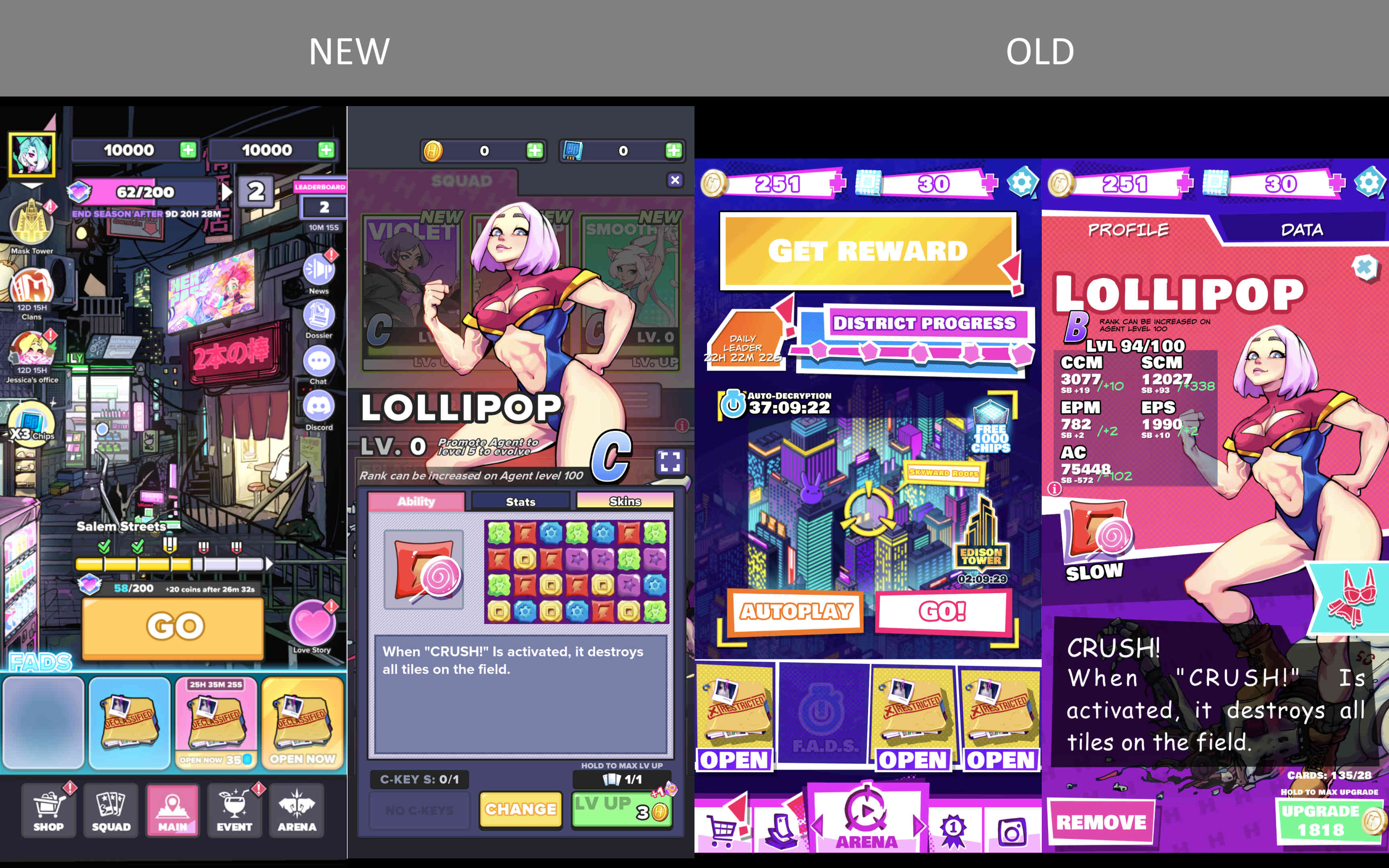
In the image, you can compare the new and old interface.
We made a single geometry for similar objects, highlighted static elements with an animated background, completely changed the logic of attention markers, they no longer stick out always and everywhere.
We've ditched annoying special offer banners in favor of a TV that's neatly integrated into the background. Both nice and less clicks.
Previously, players had to search for this information to keep updated on all the news and current events. Now we've added News, where it's all collected and organized in one place.
We paid a lot of attention to the Squad screen, we managed to implement interaction on the principle of One Click Design. Add a visualization to the description of the ability. Organized everything that the Agent will need in battle in a simple and understandable interface. Also, due to numerous requests from the players, we added the ability to view the character in full screen mode.
We have done many more interesting and cool things with interfaces and not only them. Some of them are already available to our patrons. We will talk about some of them in the next post.
P.S. If you're making an adult game, don't make it vertical.
Previous article
Get Like Heroes: Ultimate (18+)
Like Heroes: Ultimate (18+)
| Status | In development |
| Author | Spicy Studio |
| Genre | Puzzle, Role Playing, Visual Novel |
| Tags | Adult, Casual, Roguelike |
| Languages | English |
More posts
- Introducing a New Era of Like Heroes.Mar 19, 2024
- The Development Story of Like Heroes: Lessons from Failure and the Path to Succe...Mar 12, 2024
- #7. Useless characters of Like HeroesApr 04, 2023
- #4. The Battle Pass - How Marvel Helped Us Improve Our GameMar 22, 2023
- #6. Worst 2D engine for Nutaku.Mar 22, 2023
- #5: The best tutorial in the worldMar 08, 2023
- #3. Why Web is necessary even if players don't pay for itFeb 07, 2023
- #1. Why we decided to completely redesign Like Heroes.Aug 08, 2022

Leave a comment
Log in with itch.io to leave a comment.